Buffett Indicator
Overview
The Buffett Indicator (aka, Buffett Index, or Buffett Ratio) is the ratio of the total United States stock market to GDP.
Buffett Indicator =
Total US Stock Market Value
Gross Domestic Product (GDP)
As of November 30, 2023 the ratio values are:
Total US Stock Market Value = $48.41T
Annualized GDP = $27.70T
Buffett Indicator =
$48.41T
$27.70T
=
175%
This ratio varies with the passage of time since the stock market can be very turbulent, but GDP tends to grow quite steadily. 175% is the current ratio, which is about 44.17% (or around 1.4 standard deviations) higher than the trend of the past, and this would mean that the stock market is Overvalued when compared to GDP.
In the long run, the stock market valuation closes in on its average. A higher current valuation, for sure, infers with lower long-term returns in future. At the same time, a lower current valuation level leads to an increase in long-term return. The whole market valuation index is derived from the ratio of total market cap (TMC) to GNP -- the equation which represents Warren Buffett's "best single measure". This ratio from 1970 to the present is displayed in the second pie chart on the right. Gurufocus.com computes this ratio on a daily basis. As of 12/19/2023, this ratio is 172.7%.
It is apparent that the TMC/GNP ratio in the span of the last five decades experienced many up and down variations. With current value and historical month-end values as the basis, the lowest point was about 32.7% in the previous deep recession in July 1982, and it was the greatest at about 199.5% in August 2021. The market has been from Significantly undervalued in July 1982 to Significantly overvalued in August 2021.
| Based on these historical valuations, we have divided market valuation into five zones: |
| Ratio = Total Market Cap / GDP |
Valuation |
| Ratio ≤ 81% |
Significantly Undervalued |
| 81% < Ratio ≤ 104% |
Modestly Undervalued |
| 104% < Ratio ≤ 127% |
Fair Valued |
| 127% < Ratio ≤ 150% |
Modestly Overvalued |
| Ratio > 150% |
Significantly Overvalued |
| Where are we today ( 2023-12-19)? |
Ratio = 172.7%, Significantly Overvalued
|
A quick refresher (Thanks to Greenbacked): GDP is “the total market value of goods and services produced within the borders of a country.” GNP is “the total market value of goods and services produced by the residents of a country, even if they’re living abroad. If a U.S. resident makes money from an investment abroad, that income would count towards GNP (but not GDP). While it's crucial to understand the difference between the two, especially as American companies expand their international operations, the actual distinction between GNP and GDP is quite small, as shown in this chart from the St. Louis Fed:
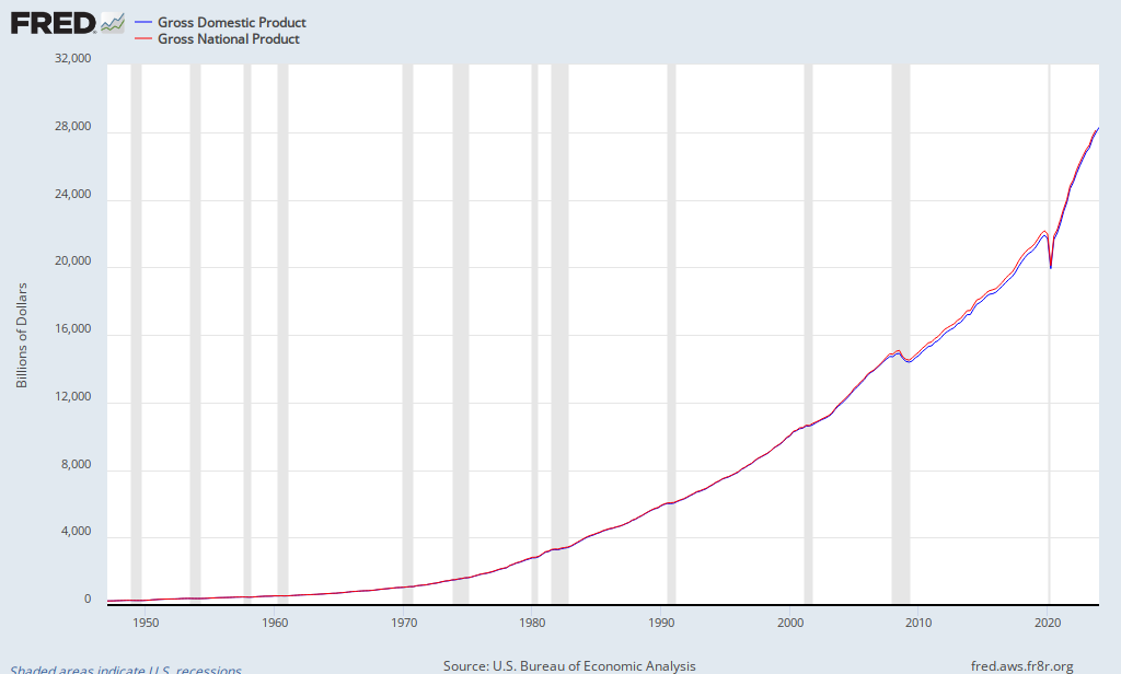
GDP in Q4 2012 stood at $ 15,851.2 billion. GNP at Q3 2012 (the last data point available) stood at $ 16,054.2 billion. For our present purposes, one substitutes equally as well for the other.
Modified Version of Market Valuations
To grasp the concept of the Buffett Indicator—the ratio of total market cap (TMC) to GNP—it's essential to consider the economic cycle. The idea is that consumption primarily drives an economy, and individuals need to produce in order to consume. Corporations earn revenue and profits through this consumption, and their profitability will eventually show up in the stock market. Therefore, GDP, which indicates the total value of production, serves as a fundamental driver for both corporate profits and total market cap.
In addition, we should consider another factor that could impact the overall market cap: the Total Assets of the Federal Reserve Bank. Similar to other financial statements, the Fed's balance sheet is made up of both assets and liabilities. The Federal Reserve, which serves as the central bank of the United States, releases its weekly H.4.1 report every Thursday. This report provides a comprehensive overview of the Condition of All Federal Reserve Banks, detailing total assets, total liabilities, and total capital. The assets held by the Fed mainly include government securities and the loans it provides to its regional banks.
For many years, the Fed's balance sheet has served as a tool for predicting shifts in economic cycles. The way the Fed expands or contracts its balance sheet can significantly impact the economy and the spending habits of both individuals and corporations, which in turn affects the stock market. Typically, the Fed purchases assets as part of its monetary policy when it aims to boost the money supply, while it sells assets when it seeks to reduce it. When the Fed's objective is to stimulate the economy, it injects more money into the market and lowers interest rates. This makes borrowing cheaper, encouraging individuals to spend and businesses to grow. Conversely, a substantial decrease in interest rates also incentivizes investment, as it enhances the value of future profits. Both scenarios can lead to increased investment in the stock market, thereby raising the overall market capitalization.
We created another market valuation indicator by considering the Fed's total assets, using the TMC/(GDP + Total Assets of Fed) ratio. This indicator functions similarly to the Buffet Indicator but provides an alternative perspective. The ratio, tracked since 1970, is displayed in the second chart to the right, allowing for a comprehensive comparison with the Buffet Indicator. Gurufocus.com calculates and updates this ratio on a daily basis. As of 12/19/2023, this ratio is 134.7%.
We can see that, during the past five decades, the TMC/(GDP + Total Assets of Fed) ratio has varied within a very wide range. The lowest point was about 31.1% in the previous deep recession in July 1982, while the highest point was about 147.3% in August 2021.
| Based on these modified historical valuations, we have divided market valuation into five zones: |
| Ratio = Total Market Cap / (GDP + Total Assets of Fed) |
Valuation |
| Ratio ≤ 67% |
Significantly Undervalued |
| 67% < Ratio ≤ 87% |
Modestly Undervalued |
| 87% < Ratio ≤ 106% |
Fair Valued |
| 106% < Ratio ≤ 125% |
Modestly Overvalued |
| Ratio > 125% |
Significantly Overvalued |
| Where are we today ( 2023-12-19)? |
Ratio = 134.7%, Significantly Overvalued
|
Criticisms of The Buffett Indicator
No single metric is illustrative of the health or relative valuation entire market. Common criticisms of the Buffett Indicator are:
Interest Rates
The Buffett Indicator only considers the value of the stock market, but does not consider how stocks are valued relative to alternative investments, such as bonds.
When interest rates are high, bonds offer a better return to investors, which leads to decreased demand (and lower prices) for stocks. Moreover, higher interest rates make it more costly for businesses to borrow money, complicating their ability to finance growth. Companies that take on debt will encounter higher interest payments, resulting in reduced profits. With lower corporate profits, stock values tend to decline. Conversely, when interest rates are low, bonds yield less for investors, reducing their appeal and consequently boosting stock prices relative to bonds. Low interest rates facilitate easier borrowing for corporations, leading to lower interest payments and, in turn, higher profits.
This means that, all else being equal, when interest rates are high, stock prices tend to decrease. Conversely, when interest rates are low, stock prices generally increase.
Over the past 50 years, the average interest rate on 10-Year US Treasury bonds has been 5.87%. At the height of the .com bubble, when the Buffett Indicator reached a peak, the 10Y Treasury rate was slightly above average, around 6.5%. This indicates that low interest rates were not inflating the stock market. Currently, the Buffett Indicator remains elevated compared to its historical trend line, while interest rates are still relatively low, sitting at 4.37%.
This suggests that during the .com bubble, equity investors had other viable options for their money, yet they still invested heavily in stocks. In contrast, today's bond investments yield relatively low returns. Investors now need to find returns elsewhere, and the low interest rates are pushing them towards riskier assets, which in turn is driving up the stock market. While this doesn't fundamentally justify the high Buffett Indicator, it implies that the current market is less likely to experience a rapid collapse like it did in 2000, and it may have valid reasons to remain unusually high as long as interest rates stay low.
For additional detail on the effect interest rates have on stock prices, view our Interest Rate Model.
International Sales
A second valid criticism of the Buffett Indicator is that stock market valuations take into account international activities, while GDP does not fully reflect this. Although GDP includes national exports, it misses out on sales made by companies like Amazon in countries such as India, where operations are managed by local fulfillment centers and sellers. Nevertheless, the performance of Amazon's business in India is certainly factored into its overall stock price, which is traded in the US. Consider the scenario where the Indian government decides to ban Amazon and shuts down all its operations there. This would likely lead to a decrease in Amazon's stock price, which in turn would lower the overall value of the US stock market, yet it would have no effect on US GDP. Consequently, the Buffett Indicator would decline. Over the past 50 years, globalization has steadily increased and has played a significant role in the growth of the Buffett Indicator, as the value of US stocks has risen due to international activities that are not captured in US GDP.
This is a valid critique of the Buffett Indicator itself, although it may not apply to the valuation model discussed here, which examines the Buffett Indicator in relation to its own exponentially growing trend line. Our model anticipates that the indicator will experience exponential growth over time, predicting a "fair" Buffett Indicator value of 50% in 1960, increasing to around 120% by 2020. Part of this natural growth can be attributed to technological advancements that boost profits for existing companies, as well as the emergence of entirely new industries. Additionally, the increase is influenced by the fact that the market value in the US is rising at a faster rate than GDP, largely due to the growth of international sales by US-based companies. The main takeaway is that the model assesses relative performance against the indicator's own trend rate, rather than simply stating that "the Buffett Indicator is high."
